Calendar exploration
This exploration is born out of my interest in visualize time and my dissatisfaction with the current state of digital calendars. One of the biggest issues I see is to have context around dates.
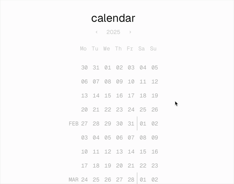
In current calendars, when a month finishes in the middle of the week it is difficult to access the first and last days, you have to go back and forth between months. There's little to no differentiation between them and makes it hard to know where you are situated.
Designed and developed in code, this calendar features dynamically updated colors to highlight the current week, and let the past and future dates fade.
Unflattening time
Time permeates everything we do. We keep time to stay organized: tracking seasons for harvesting and sports, quarters for business, months and weeks for sprints. The current nature of digital interfaces makes time look flat when in reality is highly variable phenomenon.
This explorations aim to visualize current week in a darker color signifying that is closer to you, and subsequent lighter grays to make it seem like time passed, or is coming.

Work in progress
As I continue to practice, research and write about time, new ideas will inform the continuation of this project and new features will find their place into it.
Some questions I want to explore in future iterations: how does a single month looks like in this logic? or a single week or a single day? or a random range? How to integrate this as a part of a more expansive interface?